It has many disadvantages.
I'll show two examples against subpixel rendering now:
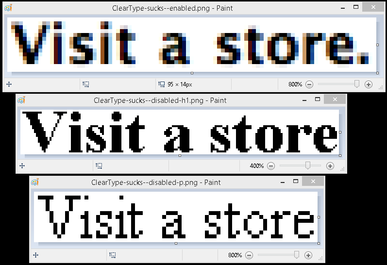
If you ever take screenshots of your screen, which you probably do quite often, try this:
Zoom in on your subpixel rendered text in the screenshot and tell me if it looks good. It won't. The text is going to be all miscolored and blurry as shown below.
http://static.3ice.hu/images/ClearType-sucks--comparison.png
And look at the file size too! Subpixel rendering increases it by 50% or more. I cut your example picture in two and then saved each half in a separate png file. The left side was 10 KB, and the right side was 15 KB. The results speak for themselves.
Don't screenshot subpixel rendered text. And don't ever zoom in on screenshots of subpixel rendered text.
Sincerely,
Daniel "3ICE" Berezvai
Your friendly neighborhood ClearType hater.
p.s.: I even like the example on the left more. Exhibit A looks better. And I use an LCD screen.